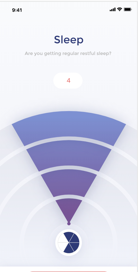
Many people living with chronic pain have a condition called photophobia – their brain interprets light as a painful stimulus. That can make looking at screens a painful experience and makes designing an app extra challenging!
We’ve been working with our designers and testing out colors with teens and migraine sufferers. Interestingly, we found that some people were most comfortable with lighter images, while others loved dark mode.
With two color palettes, people can choose what is most comfortable for them.
What was most interesting to us though was that the most painful color scheme was the one most often used by medical sites: white background with blue.


